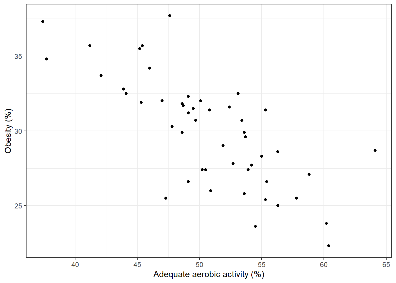
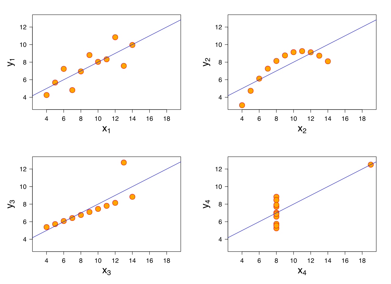
Direction of relationship: are variables positively or negatively related?
Form: is any relationship linear or more complex?
Strength of relationship: how accurately can one variable predict the other?
Influential points: are one or a few points driving the relationship we see?
Correlation
The correlation coefficient\(\rho\) quantifies the linear relationship between two random variables.
In statistics, a correlation coefficient implies a very specific type of association.
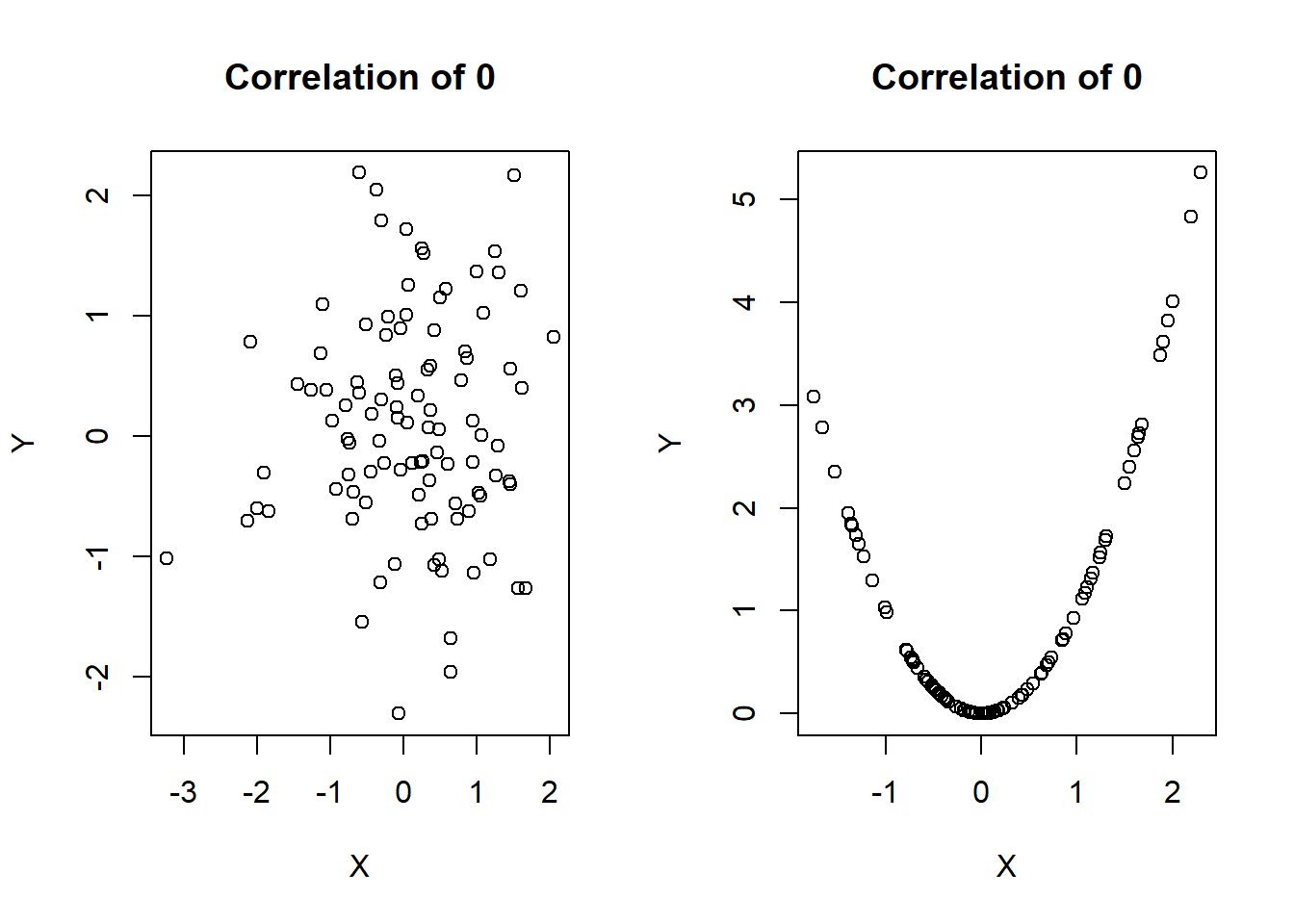
A correlation coefficient of zero does NOT imply no relationship between two variables, as we shall see in some further examples.
Correlation
\(\rho\) ranges from -1 to 1
\(\rho>0\) implies positive correlation
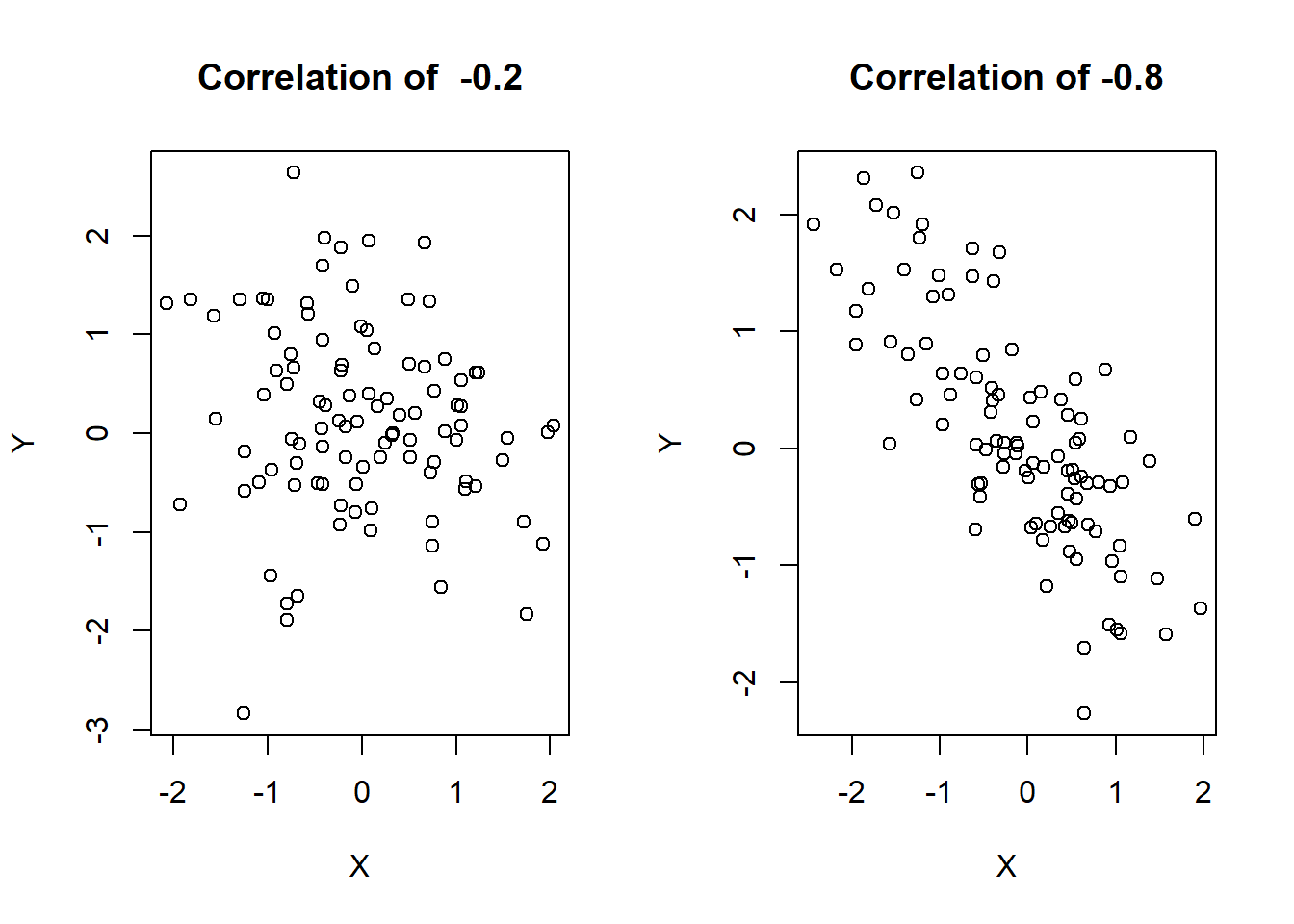
\(\rho < 0\) implies negative correlation
\(\rho = 0\) is consistent with no linear relationship between variables (again, this does not imply that no relationship exists!)
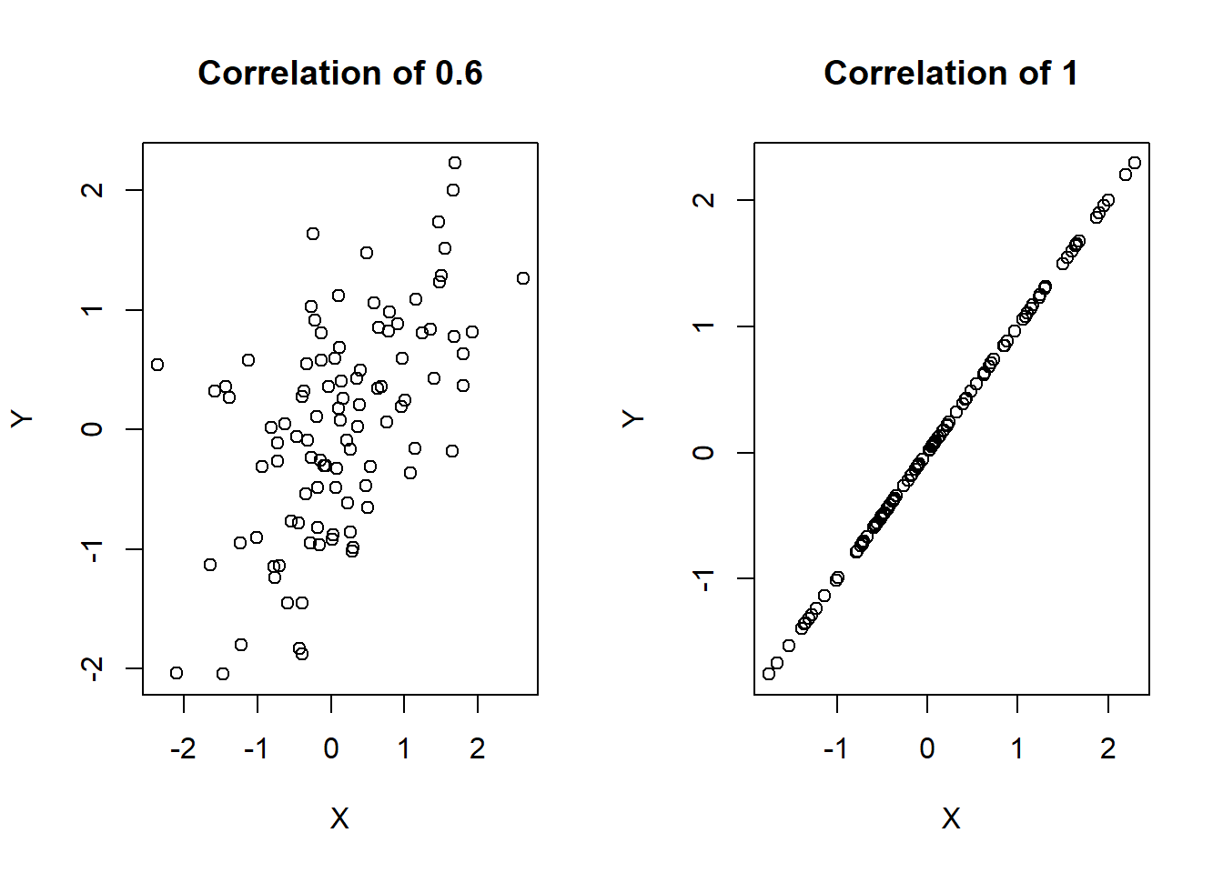
What does it mean to have a correlation of -1 or 1?
Visualizing \(\rho\)
# Load the required librarylibrary(MASS)
Attaching package: 'MASS'
The following object is masked from 'package:dplyr':

    select
# Set seed for reproducibilityset.seed(123)# Define parametersn <-100# number of data pointsmu <-c(0, 0) # means of x and ysigma_06 <-matrix(c(1, 0.6, 0.6, 1), nrow =2) # covariance matrix with correlation 0.6# Generate data with correlation 0.6data_06 <-mvrnorm(n = n, mu = mu, Sigma = sigma_06)# Generate data with correlation 1 (perfect linear relationship)x <-rnorm(n) # random x valuesy <- x # perfectly correlated y values# Set up the plotting area for side-by-side plotspar(mfrow =c(1, 2)) # 1 row, 2 columns# Create scatter plot for rho = 0.6plot(data_06[,1], data_06[,2], main ="Correlation of 0.6",xlab ="X", ylab ="Y", pch =1)# Create scatter plot for rho = 1plot(x, y, main ="Correlation of 1",xlab ="X", ylab ="Y", pch =1)
# Reset the plotting layoutpar(mfrow =c(1, 1))
Visualizing \(\rho\)
# Load the required librarylibrary(MASS)# Set seed for reproducibilityset.seed(123)# Define parameters for correlation -0.2sigma_neg02 <-matrix(c(1, -0.2, -0.2, 1), nrow =2) # covariance matrix with correlation -0.2# Define parameters for correlation -0.8sigma_neg08 <-matrix(c(1, -0.8, -0.8, 1), nrow =2) # covariance matrix with correlation -0.8# Generate data with correlation -0.2data_neg02 <-mvrnorm(n =100, mu =c(0, 0), Sigma = sigma_neg02)# Generate data with correlation -0.8data_neg08 <-mvrnorm(n =100, mu =c(0, 0), Sigma = sigma_neg08)# Set up the plotting area for side-by-side plotspar(mfrow =c(1, 2)) # 1 row, 2 columns# Create scatter plot for rho = -0.2plot(data_neg02[,1], data_neg02[,2], main ="Correlation of -0.2",xlab ="X", ylab ="Y", pch =1)# Create scatter plot for rho = -0.8plot(data_neg08[,1], data_neg08[,2], main ="Correlation of -0.8",xlab ="X", ylab ="Y", pch =1)
# Reset the plotting layoutpar(mfrow =c(1, 1))
Visualizing \(\rho\)
# Load required librarylibrary(MASS)# Set seed for reproducibilityset.seed(123)# Define parameters for correlation 0 (random noise)sigma_0 <-matrix(c(1, 0, 0, 1), nrow =2) # covariance matrix with correlation 0# Generate data with correlation 0 (random noise)data_0 <-mvrnorm(n =100, mu =c(0, 0), Sigma = sigma_0)# Simulate parabolic data (correlation is 0, but there's a clear nonlinear relationship)x_parabolic <-rnorm(100) # random x valuesy_parabolic <- x_parabolic^2# y is a parabolic function of x# Set up the plotting area for side-by-side plotspar(mfrow =c(1, 2)) # 1 row, 2 columns# Scatter plot for correlation 0 (random noise)plot(data_0[,1], data_0[,2], main ="Correlation of 0",xlab ="X", ylab ="Y", pch =1)# Scatter plot for parabolic relationship (correlation 0, but nonlinear)plot(x_parabolic, y_parabolic, main ="Correlation of 0",xlab ="X", ylab ="Y", pch =1)
# Reset the plotting layoutpar(mfrow =c(1, 1))
Pearson’s correlation coefficient
Pearson’s correlation\(r\) gives and estimate of \(\rho\) as follows. Assuming our observed data are the pairs \((x_1, y_1), (x_2, y_2), \ldots, (x_n, y_n)\), we can calculate \(r\) as
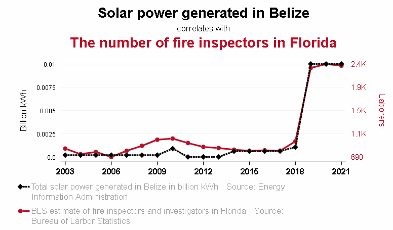
Some of these spurious correlations are due to confounding - when a third lurking variable is responsible for the observed relationship.
Example: A near perfect negative correlation (r = -0.99) was seen between cholera mortality and elevation above sea level during a 19th century epidemic.
The observed relationship between cholera and elevation was confounded by a lurking variable, proximity to polluted water.
ggcorrplot
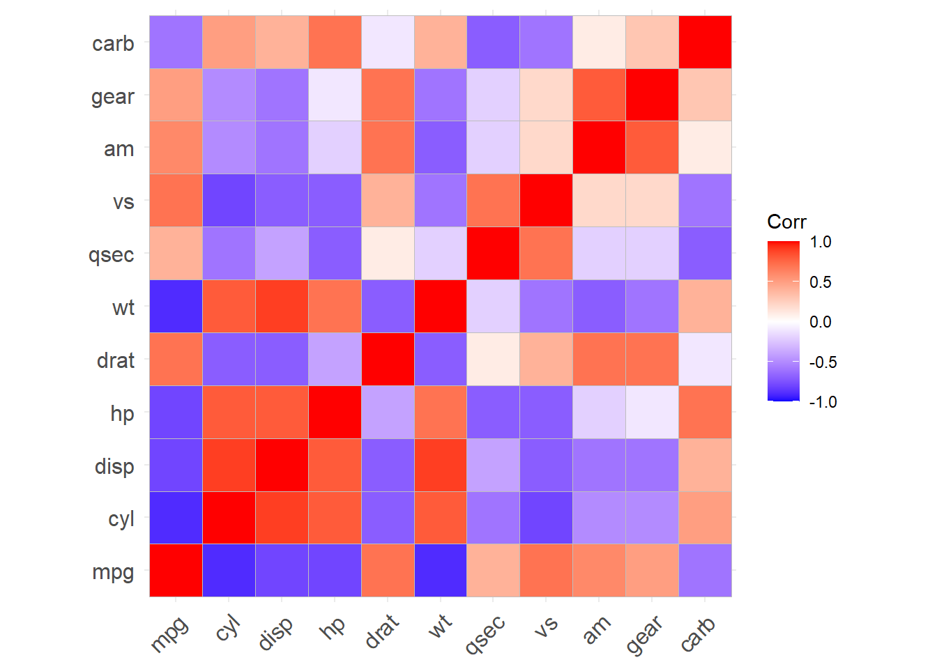
ggcorrplot is a fantastic function for making correlation plots in R.
mtcars is a built-in R dataset, taken from the 1974 Motor Trend US magazine. It has fuel consumption and 10 aspects of automobile design/performance for 32 automobiles.
# Compute a correlation matrixdata(mtcars)corr <-round(cor(mtcars), 1) # round to 1 decimalhead(corr[, 1:6])
# Visualize the correlation matrix# --------------------------------# method = "square" (default)ggcorrplot(corr)
Plotting the correlation: output
Warning: `aes_string()` was deprecated in ggplot2 3.0.0.
ℹ Please use tidy evaluation idioms with `aes()`.
ℹ See also `vignette("ggplot2-in-packages")` for more information.
ℹ The deprecated feature was likely used in the ggcorrplot package.
  Please report the issue at <https://github.com/kassambara/ggcorrplot/issues>.
Testing the correlation
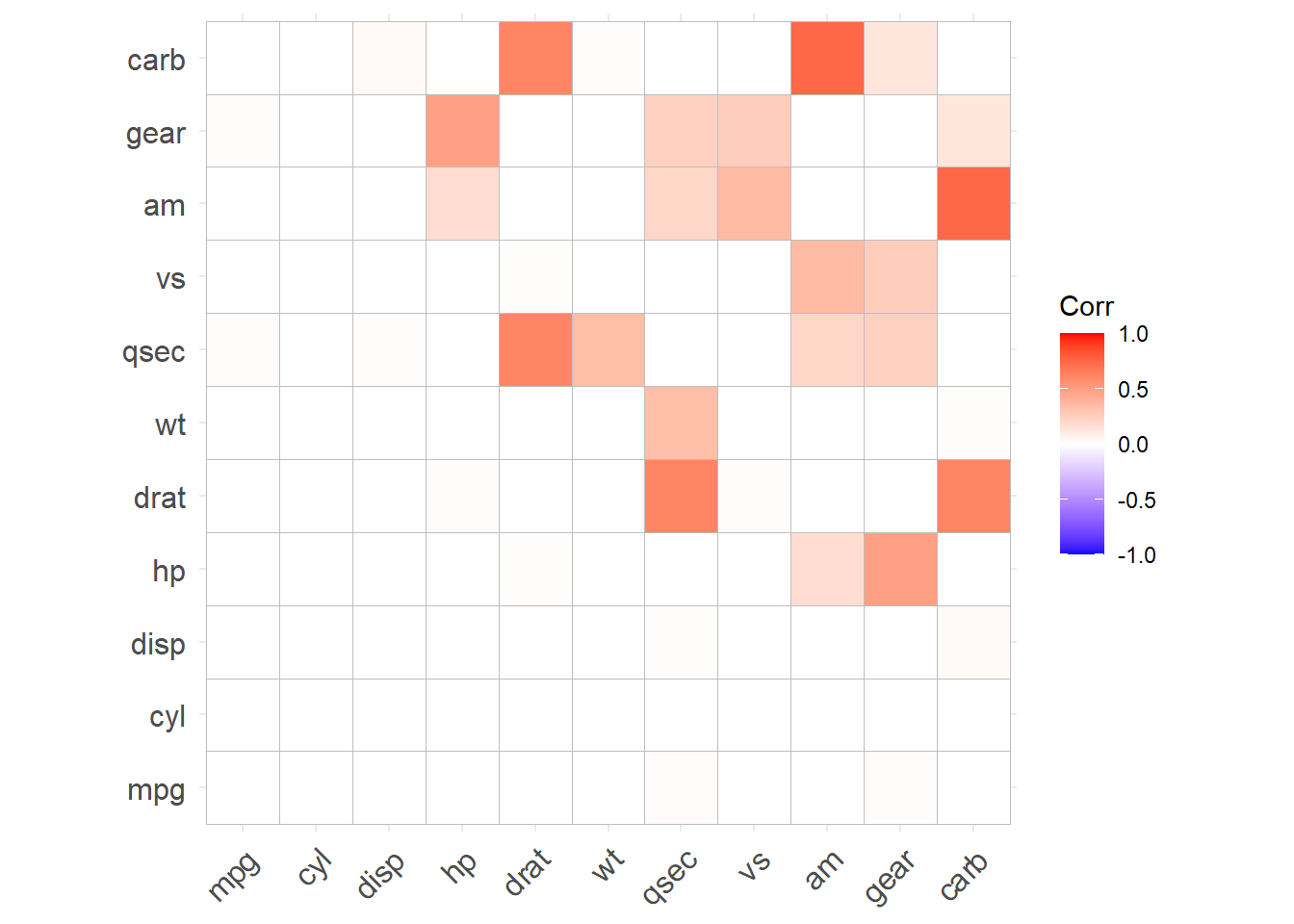
We can also test whether or not each correlation is statistically equal to zero.