cdc <- read.csv("https://karamccor.github.io/b6002/labs/data/cdc_cleaned.csv")

# cdc <- read.csv("https://www2.stat.duke.edu/courses/Spring21/sta102.001/labs/data/cdc_cleaned.csv")

# write.csv(cdc, "C:/Users/kmcco/OneDrive - University of North Carolina at Chapel Hill/Documents/UNC_Teaching/fall2024/bios600-f24/labs/data/cdc_cleaned.csv")Lecture 2: The nature of data
BIOS 600 - Spring 2026
Reading
- No reading for today
Announcements
- Lab due this Friday at 11:59pm.
Survey results
Interests
- Global health equity, epidemiology, clinical research, biomedical engineering, biology, community-based participatory research, social sciences, regression, nutrition, public health, oral health, biophysics, medicine, health policy, maternal health, analytical chemistry, toxicology, environmental epidemiology, business and technology, data science, delivery models, substance use, aging, …and more!
Hopes
- Getting more comfortable coding in R, learning biostatistics, to apply to own research or future classes.
R + supportive learning
R experience: About half are beginners, one-quarter never used, one-quarter intermediate.
What supports learning: step-by-step examples + independent practice, hands-on coding, visuals, group work + discussion, clear instructions
Many shared being nervous about coding and learning statistics in general. That’s okay - we are here to support you!
Remember you can post a question at any time on Ed Discussion. You can even post anonymously. The teaching team is here to help.
There are tutors available through Gillings–I will share more info on Canvas soon.
If you can’t make normal office hours, we can definitely schedule other times to meet!
Review from last time
TipPopulations and samples
Consider the following research questions:
- What is the average mercury content in swordfish in the Atlantic Ocean?
- Over the last five years, what is the average time to complete a degree for UNC undergrads?
- Does a new drug reduce the number of deaths in patients with severe heart disease?
In small groups, identify the target population and what represents an individual case for each of the questions above.
Exploratory data analysis (EDA)
- Initial data analysis approach that summarizes main characteristics of dataset
- Often visual or in the form of basic summary statistics
Data visualization
- The creation and study of the visual representation of data
- Many tools available (R is popular; many systems within R for data visualization)
- Creating visualizations helps us see patterns and identify potential data quality issues
- We will focus on ggplot2, a component of the tidyverse
ggplot2 in tidyverse
- The tidyverse is a group of R packages designed for data science
- All tidyverse packages share an underlying design philosophy
- Data visualization package in the tidyverse
- Inspired by The Grammar of Graphics (Wilkinson)
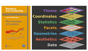
What is a Grammar of Graphics?
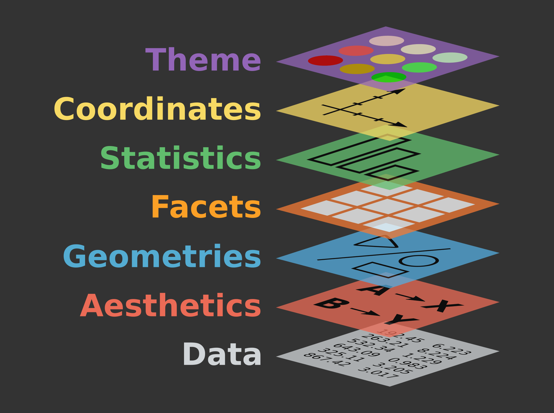
- A system allowing for concise description of graphical components
What is a Grammar of Graphics?
A statistical graphic is
- data (which may be statistically summarized or transformed)
- mapped to aesthetic attributes (color, size, xy-position, etc.)
- using geometries (points, lines, bars, etc.)
- mapped onto a specific coordinate and/or facet system
Types of data
Categorical data
Nominal data
- Named categories without numeric meaning
- Ex: Only two categories: binary or dichotomous
- Ex: breast cancer status, blood type, health insurance provider type, etc.
Ordinal data
- Ordered categories, but differences between values not easily measured
- Relative comparisons made about differences between levels
- Stage of colon cancer, Likert scale, frequency of smoking (often, sometimes, rarely, never), etc.
Numerical data
Count or rank data
- Discrete counts. Or ranks.
- Number of alcoholic drinks consumed in the past week, numerical rank of cancers by mortality, etc.
Continuous data
- Measurable quantities where difference between possible values can be arbitrarily small
- Data may lie within a range or be unbounded
- Birth weight, BMI, ppm ozone, etc.
Identifying data types
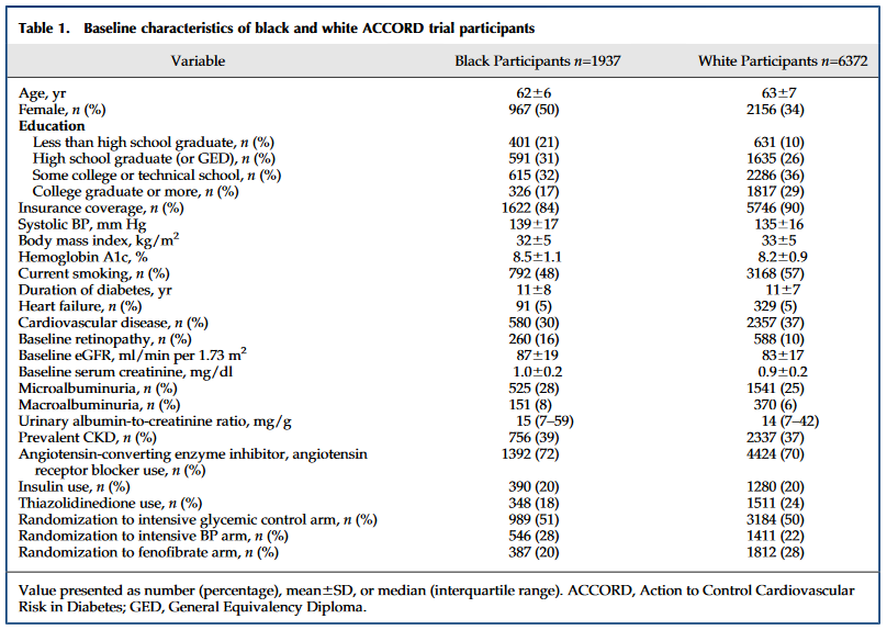
Identifying data types
TipIn small groups, discuss the following:
According to the table on the previous slide, what kind of data types are the following variables?
- Age
- Female
- Education
- Hemoglobin A1c
- Current smoking
Use the convention “Numerical; continuous” or “Categorical; Ordinal”, etc.
Complications
In designing a study, what variable should we use for smoking exposure?
- Binary variable yes/no?
- Ordinal current/former/never smoker?
- Discrete number of cigarettes smoked in past week?
- Continuous measurement of lifetime pack-years?
In the real world, decisions are made based on sample size, statistical power, likelihood of measurement error, or simply convenience (this happens a lot!)
Visualizing CDC data
Let’s take a look at some basic visualizations using state-level data collected by the Center for Disease Control (CDC). We’ll examine the following variables:
- State (categorical; nominal)
- Human Development Index (HDI) (categorical; ordinal)
- a composite index that measures a country’s average achievements in health, knowledge, and standard of living
- Region (categorical; nominal)
- Adult obesity % (numerical; continuous)
- Adequate aerobic activity % (numerical; continuous)
Bar charts
ggplot(data = cdc, mapping = aes(x = Region)) +
  geom_bar(fill = "steelblue") +
  labs(title = "Number of US States by Census Region",
       x = "Region", y = "Count") +
  theme(text = element_text(size = 18))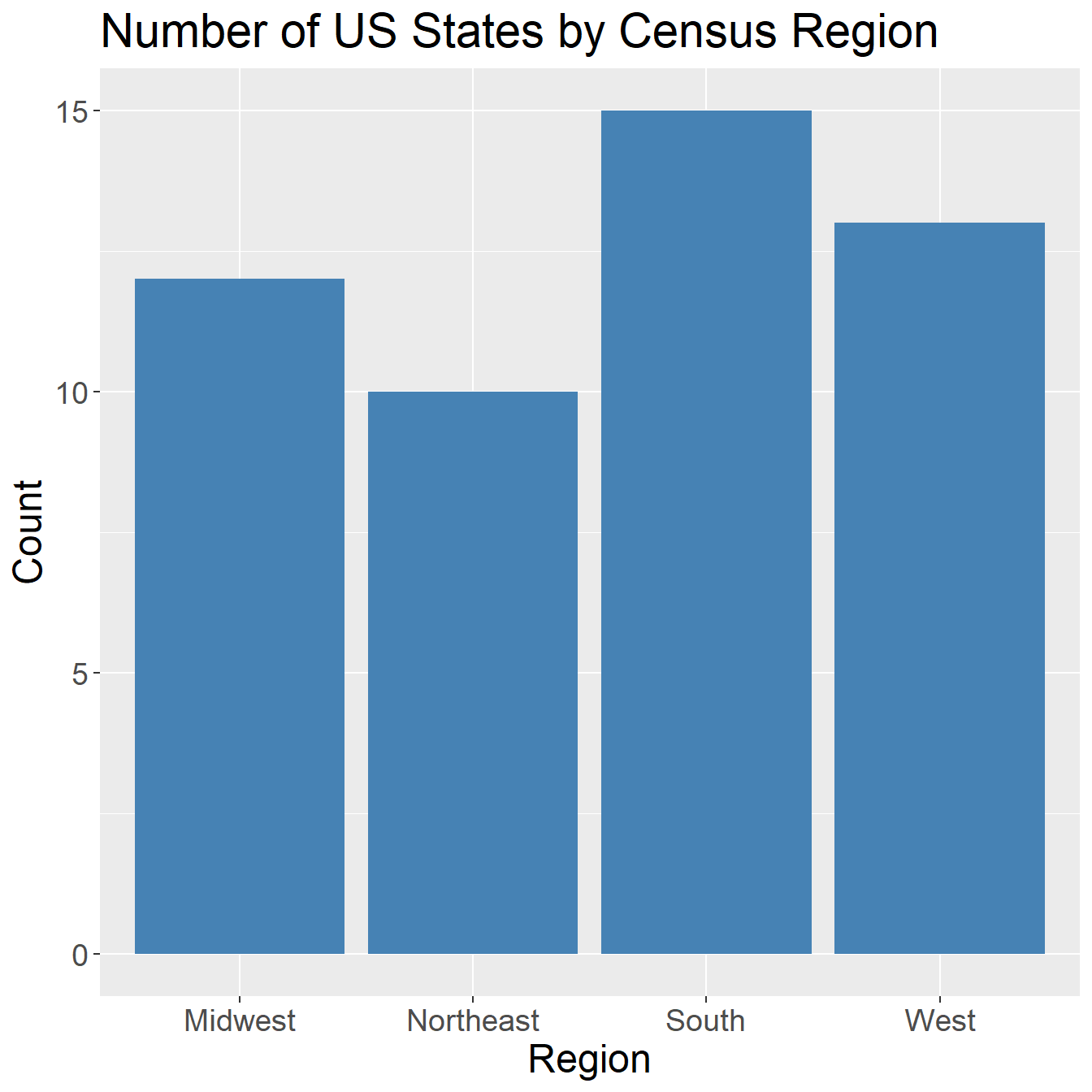
- Summarizes numerical variable by categories
- Visually depict frequency distributions for nominal or ordinal data
- Bars represent either frequency or relative frequency by category
- Separation between bars (non-continuous data)
- May contain error bars to indicate estimate variability
Box plots
ggplot(data = cdc, aes(x = HDI, y = Obesity)) + geom_boxplot()+
  labs(title = "Adult Obesity (%) by State HDI",
       x = "HDI", y = "Adult Obesity (%)") +
  theme(text = element_text(size = 18))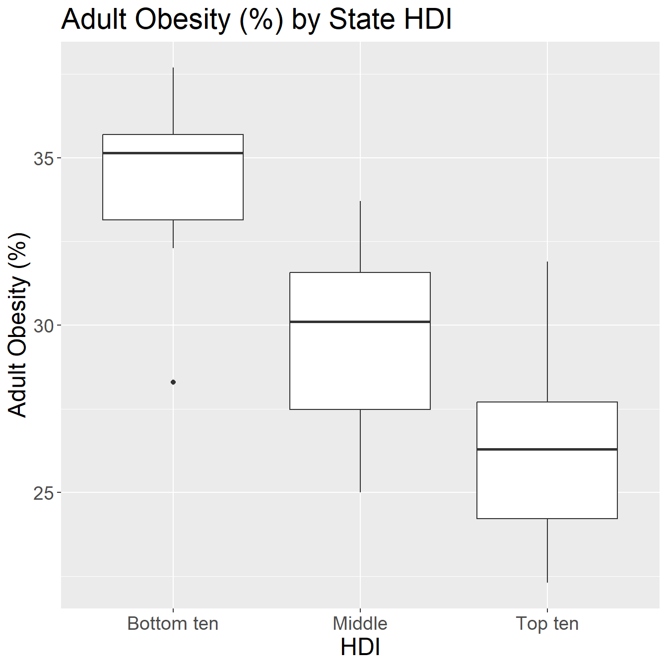
- Summarizes numerical variable
- Five-number summary: sample minimum, 25th percentile, median, 75th percentile, sample maximum
- Outliers
- Spread and skew
- (More on all these later!)
Histograms
ggplot(data = cdc, aes(x = Obesity)) +
  geom_histogram(color = "darkblue", fill = "lightblue", binwidth = 2)+
  labs(title = "Distribution of Adult Obesity (%) by State",
       x = "Adult Obesity (%)", y = "Count") +
  theme(text = element_text(size = 18))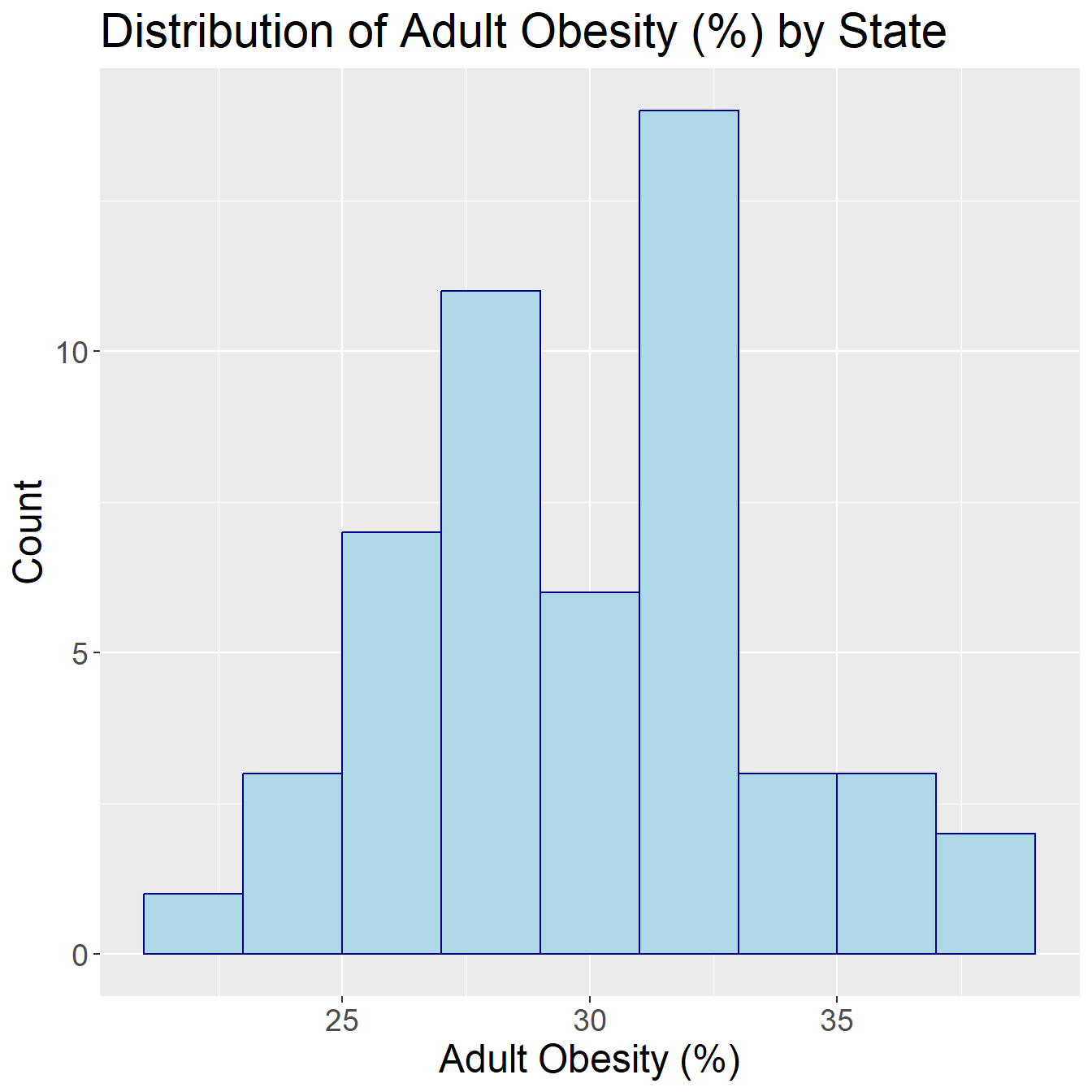
- Summarizes numerical variable
- Frequency distribution for discrete or continuous numerical data
- Outliers
- Each bar is proportional to the frequency of the categories
Line plots
ggplot(data = cdc[1:4,], aes(x = State, y = Obesity, group = 1)) +
  geom_line() +
  geom_point() +
  labs(title = "Obesity by State",
       x = "State", y = "Adult Obesity (%)")+
  theme(text = element_text(size = 28))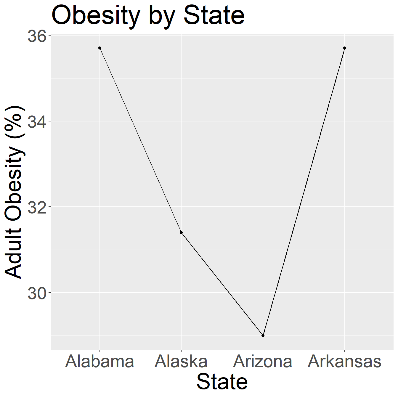
WarningQuestion
Is this plot useful?
- Summarizes numerical variable (most often used across time)
- Each value on x-axis corresponds to only one measurement on y-axis (and vice versa)
- Often used to depict change over time and connected with line.
Scatterplots
cdc |>
  ggplot(aes(x = Exercise, y = Obesity)) +
  geom_point() +
  facet_grid(. ~ HDI) +
  ggtitle("Adequate aerobic activity \n associated with lower obesity") +
  xlab("Adequate aerobic activity (%)") +
  theme(text = element_text(size = 28),
        axis.text = element_text(size = 16))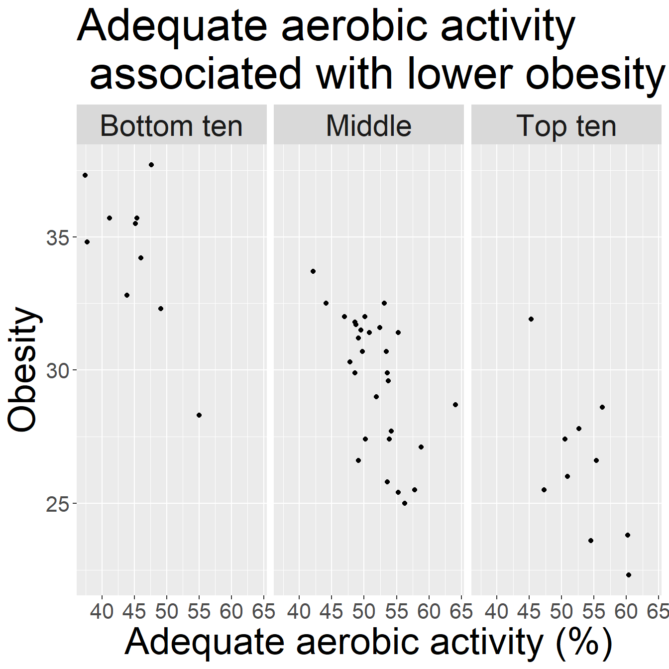
Shows relationship between multiple continuous measurements
You can add color, shape, transparency, etc to further differentiate by category
Some best practices
- Keep it simple
- Summarize and highlight
- Tell a story with the plot (use “active titles”)
- If possible, replace text with visuals
Reminder: the population vs. a sample
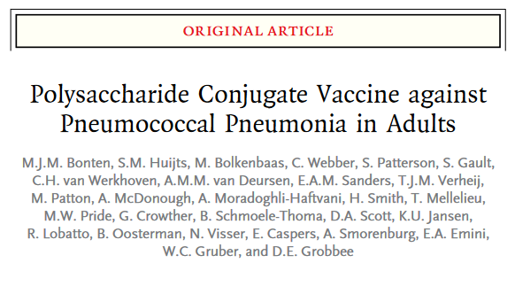
Population and research question: Is the PCV13 vaccine effective against community acquired pneumonia in adults aged 65 or older?
Sample: 84,496 adults 65 years of age or older recruited in a trial between September 2008 and January 2010 and 101 sites throughout the Netherlands.
Parameters and statistics
Parameters
- Attribute of the population of interest
- Not computable directly (unless entire population is perfectly measured)
- Written in Greek letters
Statistics
- Attribute of a sample
- Function of the observed values at hand
- Confusingly, both the function and the values
- Written in Roman letters
Example
Population parameter of interest: vaccine efficacy among all adults aged 65 or older
Sample statistic collected: proportion of vaccinated adults in the trial who became ill with community-acquired pneumonia
Numerical summary statistics
Mean
- Sample mean: the arithmetic average of values in the sample:
\[\bar{x} = \frac{1}{n}(x_1 + \ldots + x_n) = \frac{1}{n} \sum_{i=1}^n x_i\]
Population mean \(\mu\) is calculated the same way, but would involve sum over every observation in the population (rarely possible!)
The sample mean is a point estimate of the population mean
Not the exact population mean (unless lucky), but for a representative sample, it’s a pretty good guess
As the sample size gets larger, on average \(\bar{x}\) gets closer and closer to \(\mu\)
Median
Sample median: the \(50^{th}\) percentile
Middle number of observations after being ranked in numerical order
For odd number observations, it is the exact middle value; otherwise, it is the arithmetic average of the middle two.
Example: What is the median of \(\{3, 4, 5, 5, 7, 8, 9, 9\}\) ?
More robust to extreme values or outliers when compared to the mean.
Mode
- Sample mode: the most frequent value in the dataset
- There does not only have to be one mode (we can have bimodal or trimodal or other multimodal distributions)
- Example: What is the mode of \(\{1, 2, 3, 4, 4, 5, 5, 5, 7, 9\}\)?
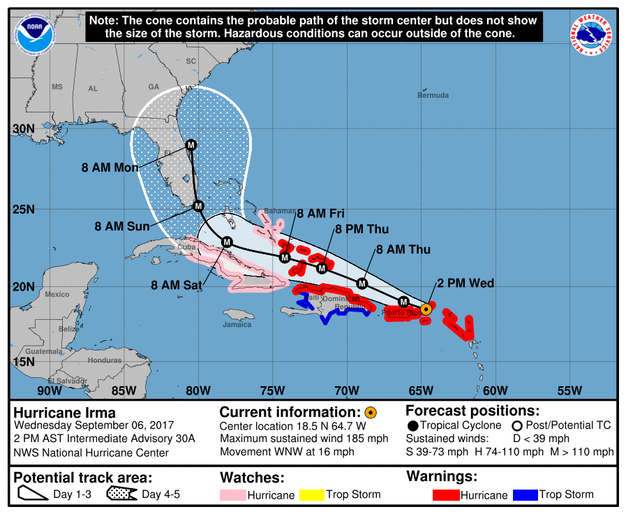
Are point estimates of location enough?
Skewness
# Set the seed for reproducibility
set.seed(123)

# Simulate data from a normal distribution
normal_data <- rnorm(400, mean = 0, sd = 1)

# Transform the data to make it right-skewed
right_skewed_data <- exp(normal_data)

# Create a histogram
hist(right_skewed_data, breaks = 30,
     col = "darkgoldenrod3", main = " ",
     xlab = "Value")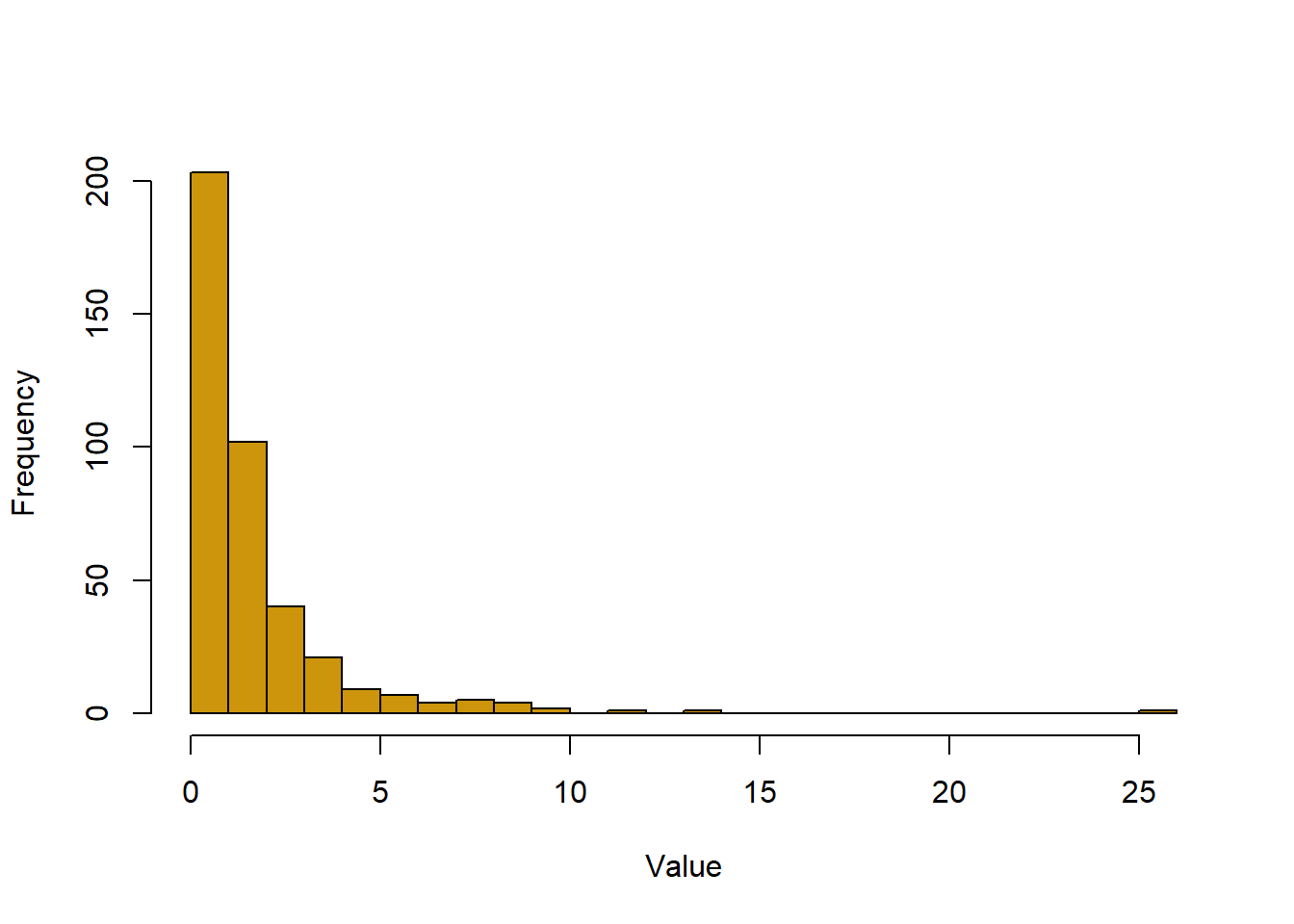
Skewed distributions are not symmetric
They can be right or left skewed depending on which side the “tail” is on.
Minimum, maximum, and range
Sample minimum and maximum: the smallest and largest observations in the dataset
Sample range: the difference between the sample maximum and the sample minimum
Quantiles
Cutpoints dividing the data into equal-sized groups (tertiles, quartiles, quintiles, percentiles, etc.)
First quartile (Q1) and third quartile (Q3) cut off the bottom and top 25%, respectively
Interquartile range (IQR): Q3-Q1; shows the width of the middle 50% of the data
The sample minimum, Q1, Q2 (median), Q3, and maximum are sometimes called the five number summary
Outliers
Observations numerically distant from others (definitions vary)
Statistical methods robust to outliers (e.g. the median) can be used if outliers are problematic
For example: the mean of 1, 2, 3, 4, 5, 10 is 4.1667, while the median of the same set of numbers is 3.5.
Should be noted and handled carefully! (e.g. maternal ages of 11 vs 111 in a dataset)
Standard deviation
- Sample standard deviation: most common measure of spread, based on deviations around the mean
\[s = \sqrt{\frac{1}{n-1} \sum_{i=1}^n (x_i - \bar{x})^2}\]
Population SD \(\sigma\) is calculated the same way, but requires sum over everyone in the population (with \(\bar{x}\) replaced by \(\mu\))
Same units as original dataset for easier interpretation
Often used to express confidence (e.g. a margin of error for a poll being around \(\pm\) 2 SD of the mean)
Squared deviations weight larger deviations more heavily,
and so also positive and negative deviations do not cancel out
Variance
- Sample variance: approximately the average squared deviation from the mean
\[s^2 = \frac{1}{n-1} \sum_{i=1}^n(x_i - \bar{x})^2\]
- Estimate of the population variance \(\sigma^2\)
- Division by \(n-1\) instead of \(n\) to avoid bias in small samples
- Don’t worry about that right now, more details in a subsequent statistics class if interested
How big are most values?
- For a distribution of any shape, most of the data are within “average \(\pm\) \(k\) SDs”
Chevychev’s bounds
| Range | Proportion |
|---|---|
| Average \(\pm\) 2 SDs | at least \(1-\frac{1}{4}\) = 75% |
| Average \(\pm\) 3 SDs | at least \(1-\frac{1}{9}\) = 89% |
| Average \(\pm\) 4 SDs | at least \(1-\frac{1}{16}\) = 94% |
| Average \(\pm\) 5 SDs | at least \(1-\frac{1}{25}\) = 96% |
If we know the exact distribution (coming soon), we can often calculate better bounds
However, these bounds hold for any distribution (that has a well-defined mean and variance)
Why is Chebyshev’s inequality useful?
You may have heard of the “68-95-99.7” rule. (68% of your data are within 1 SD, 95% are within 2 SD, 99.7% are within 3 SD).
However, this only works for bell-shaped (normal distribution) data.
Chebyshev holds for all distributions - no matter how skewed or irregular!
Why not always use means and SDs?
set.seed(123)
# Calculate the mean and standard deviation of the right-skewed distribution
mean_skewed <- mean(right_skewed_data)
sd_skewed <- sd(right_skewed_data)

# Simulate a symmetric normal distribution with the same mean and standard deviation
symmetric_normal_data <- rnorm(1000, mean = mean_skewed, sd = sd_skewed)

# Create a histogram of the symmetric normal distribution without axes, axis labels, or main title
hist(right_skewed_data, breaks = 30,
     col = "darkgoldenrod3", main = " ",
     xlab = "Value")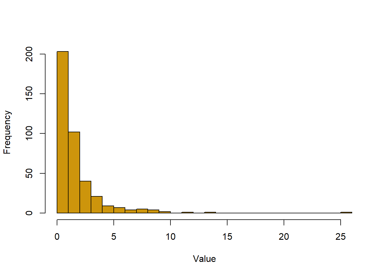
hist(symmetric_normal_data, breaks = 30, ann = FALSE, col = "darkgoldenrod3")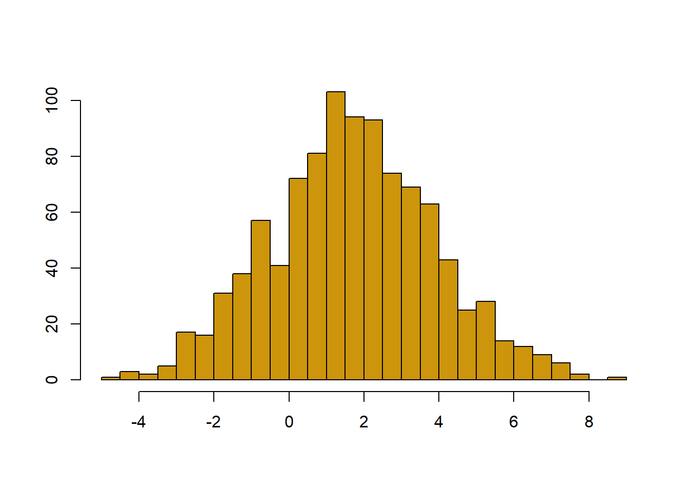
These two distributions have the same mean and standard deviation, but are clearly very different!
- Exploratory data analysis can help us visually see differences in two datasets that basic statistics (e.g. mean and sd) might not reveal
Group discussion
Go to this paper: https://pmc.ncbi.nlm.nih.gov/articles/PMC8851219/pdf/sur.2020.429.pdf (Also linked on Canvas)
- Exploratory data analysis of 2017 Nationwide Inpatient Sample (NIS) from the Healthcare Cost and Utilization Project (HCUP).
Based on the table (pg. 593), what are the mean and median of the Total charges for emergency general surgery (EGS)? What might this mean about outliers?
Based on the histogram (pg. 595), does the data follow a normal distribution? How do you know?
What do the histogram and boxplot reveal that summary statistics alone might miss?
Which measure of center and spread are more appropriate here and why?
Recap
- Exploratory data analysis: initial data analysis that summarizes key aspects of data
- Types of data: categorical, numerical
- Examples of plots: bar charts, box plots, histograms, etc.
- Population vs. sample
- Numerical summary statistics: mean, median, mode
- Quantiles, outliers, standard deviation vs. variance, Chebyshev’s inequality
Sneak peek for lab next week
- For lab next Tuesday, you’ll need to install the
tidyversepackage. Do so with the following in your Console:
install.packages("tidyverse")Next up
- Tuesday’s Class: Probability basics